Givology Revolutionizes Education Support with a New WordPress Website

Overview
To enhance its support for students through various projects, Givology sought a new WordPress platform that prioritized clear, engaging design and maximum usability for donors and students alike. Techtic Solutions, known for digital product design and development, crafted a modern website that meets contemporary web design standards and user needs. This new platform aims to streamline navigation, encourage contributions, and foster engagement effectively.
Technology Stack
Industry
B2B and B2C Websites
Tools & Technologies
HTML, CSS, JavaScript, WordPress, MySQL
Services
Revamp of PHP Website, Design & Development
Problem
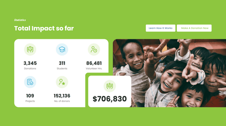
Givology’s old website faced significant issues, including an outdated design and poor navigation, making it difficult for users to find content and donate. The site lacked key functionalities like advanced search and dynamic content posting, and it was not mobile-responsive, leading to a subpar experience for mobile users. Additionally, inefficient content management made it hard to update and maintain the site, resulting in outdated information and reduced credibility. These problems hindered Givology’s ability to effectively support students and projects, necessitating a complete redesign.
Our Approach
- Custom WordPress Theme For Givology's Brand Consistency
- Informative Multimedia Content Highlights Givology's Success
- Extensive Donor Information Management To Boosts Engagement and Security
- Streamlined Donation Management Boosts User Participation
- Interactive Community Elements Drives Engagement and Participation
01.
Custom WordPress Theme For Givology's Brand Consistency
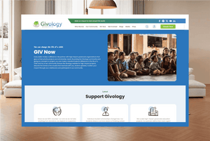
Our work included creating a new theme considering the website of Givology; our reference designs were made on Figma to be optimizable with the target devices which include the desktops, the laptops, and the mobiles. This allowed for a brand image to be created and maintained across all platforms to suit Givology’s needs and give students a user-friendly platform to work with.

02.
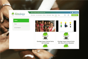
Informative Multimedia Content Highlights Givology's Success
There are distinct sections of the media that comprise photos, videos, press releases, and annual reports. These media sections offer the audience diverse, informative content through which people can learn more about the goals and accomplishments of Givology while obtaining updates about the project.
03.
Extensive Donor Information Management To Boosts Engagement and Security
The information hub about the donors is further enriched to offer comprehensive account management solutions on the website. The donor can also maintain their details, payments, and donation preferences, as well as monitor any previous donations they have made. This feature is relevant since it makes the user feel special by offering them a unique and also secure identity.

04.
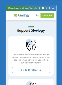
Streamlined Donation Management Boosts User Participation
The layout of the website should encompass strong donation management capabilities. So, the donors can directly contribute their money to the students, different projects, or to the Givology organization. There are distinctive elements that simplify the donation process through well-designed donation tabs and segmentized project sections.
05.
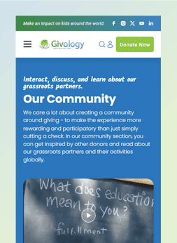
Interactive Community Elements Drives Engagement and Participation
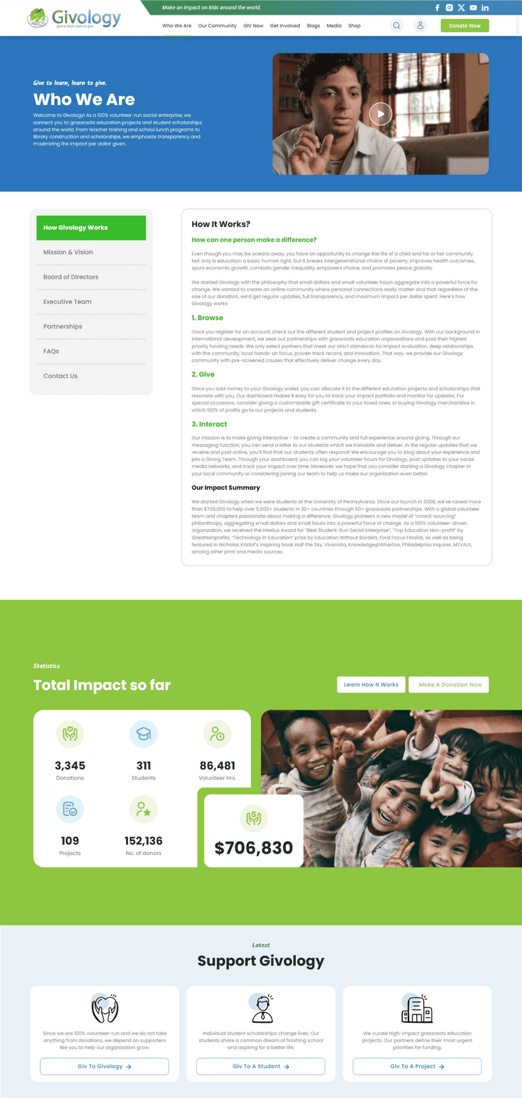
We engaged in interactive community sections that included donors, partners on the field, and giving teams. To gain further information on these areas and participate in activities concerning the community, users can navigate into the following subdivisions.
Outcomes
With the new Givology WordPress website, overall interaction and user satisfaction have been notably enhanced. The custom theme and the use of responsive design significantly enhance users’ ability to navigate through the site and get to the necessary information. The improved navigation bar and added search functions allow users to easily locate and contribute to projects and students, resulting in increased participation.
The dynamic content integration has helped users stay engaged and active, while the efficient donation management system has significantly increased the number of completed donations and reduced the number of abandoned donations. The highly intuitive nature of the CMS enables Givology’s administrators to update content frequently, ensuring that the website remains fresh and engaging. Altogether, the changes to the website have improved Givology’s online identity, making it easier to bring happiness and help to students and projects.
Need Help With Your Project?
Let’s start the conversation and make great decision together.
All projects are protected by NDA and IPs


