Effective Visual Merchandising Strategies for eCommerce Success
Sector: Digital Commerce
Author: Nisarg Mehta
Date Published: 06/08/2024

Contents
- Factors to Consider When Designing an eCommerce Store
- Steps Designing Effective Product Pages
- Considerations for UI and UX
- Psychological Principles in Visual Merchandising
- A/B Testing and Improvement
- Top Examples of Visual Merchandising in eCommerce
- Ending Note: Designing Product Pages for Maximum Conversions
Visual merchandising in eCommerce aims to make a product more appealing to the customers and stimulate their desire to buy.It is about the optimal placement of images and descriptions of products and other items on the website that facilitate shopping.
It has been found that about 75% of consumers determine the credibility of a company based on a website design. This means that there is a definite correlation between product pages that are well designed and improve conversion rates.
Through visual merchandising, an organization is well positioned to create a strong brand image. It helps your potential customers easily identify your brand and be more trusting of your products and services. It is, therefore, crucial to ensure that there is effective visual merchandising as this will help to draw attention to some of the features or benefits of the products that are being marketed.
In this article, we will take a closer look at the concept of visual merchandising in the context of eCommerce and offer helpful strategies for laying out product pages for the highest chance of conversion.
So without further ado, let’s get started.
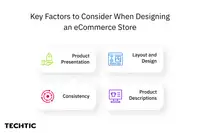
Factors to Consider When Designing an eCommerce Store
So here is what you could work on in order to get more clicks, views, and, eventually, purchases:

Product Presentation
Product presentation is significant especially for online businesses. Pictures, videos and aerial or 360-degree photos are important factors which give customers necessary information about the product they want to purchase. Such pictures need to be sharp, of a high resolution, and depict the product from different sides and perspectives. Videos can give one a better perspective, showing people how the product can be used in various occasions.
Layout and Design
The appearance and placement of your product pages is a critical aspect that determines the outcome of consumers’ interaction with you. By being concise and avoiding clutter, this website has appropriate amounts of white space to help guide the customer’s focus to the product. Similar items should be categorized together, and headers with subheaders should be used to direct users through the page.
Consistency
Another important step is to maintain cohesiveness in terms of how product pages look as this strengthens the brands’ image. Continuity is important, use the same font type, colors, and style throughout the website to achieve this effect. This consistency helps to make your brand familiar to people and can encourage their trust.
Product Descriptions
Correcting and detailed information of the product is a fundamental aspect of visual merchandising. Such should be brief, full of specific unique selling propositions and point to certain aspects of the product. Try to keep the language friendly and check with your chosen points list format that it is easy to read.
Steps Designing Effective Product Pages
Here are some quick steps you can take in order to design the best-performing product pages:
Optimized Images
Optimized images are also important to enable the loading of product pages and make them more appealing. It is recommended to post high-quality images of the product which should be in different angles. Make sure that the file sizes are adjusted in a way that will make the page to be easily downloaded without compromising on the quality of the file. It is a fact that Websites with long loading times are actually able to lose 38% of their visitors.
Engaging Videos
There is much more that a video can do to ensure that the shopping experience is improved. They also offer a flexible way to demonstrate the benefits of owning the product as well as its use.
Interactive Elements
Several designs such as zoom features, color swatches, and size selectors increase customer interaction and improve shopping. The former enables customers to easily examine the product and make the right choices.
Clear Call-to-Actions (CTAs)
Well-crafted and persuasive CTAs inform customers that they are ready to, and should, buy something. It is recommended to avoid generic phrases such as ‘Click Here’ or ‘Order Now’, instead, phrases such as ‘Buy Now’ or ‘Add to Cart’ should be used and located conspicuously on the page. Make sure that the CTA buttons are easily seen by using different color schemes.
Considerations for UI and UX
Here are some strategies to improve user experience on your eCommerce store:

Navigation and Search
Easy to get around and scroll the site, quick access to the needed page is important for user satisfaction. It is necessary that it should have a comprehensible menu bar and ‘search’ option for the customers so that they can easily navigate through the website.
Mobile Responsiveness
Since a considerable number of people use their phones to shop, it is crucial to have a mobile-friendly theme. Your product pages must be visually appealing and have good usability on any devices. Mobile website responsiveness is an essential factor; a total of 57% of users will not recommend businesses with a bad mobile website.
Loading Speed
Another important general idea is that the page load speed is important. Millennials, the increasingly more significant customer base, proved to be intolerant of slow loading web pages, which results in high bounce rates. Ensure every page loads within two seconds.
Accessibility
This is an important concept that makes it possible for everyone, especially those with disabilities, to be able to use the website. Content must be designed using alt text for images, appropriate font selection and layout that is navigable using only the keyboard. By pursuing accessible website design it is possible to not only meet the legal obligations but also attract new clients.
Psychological Principles in Visual Merchandising
There have been a lot of studies on customer’s shopping behavior. Here are the most commonly known facts:
Color Psychology
Emotions can also play a role in customer interaction but colors are even more important because they can be actual deciding factors of customers’ trust. Choose colors from your brands’ pallet and which kind of feeling you want to encourage. For instance, blue is usually associated with trust, whereas red can make the consumer feel rushed/energized.
Social Proof
Word-of-mouth endorsement such as the so-called ‘recommendation from peers,’ contributes to a boost in trust and believability. It increases the potential client’s confidence, because they are likely to be convinced by the text revealing that more people have taken your product and they were satisfied with the result.
Scarcity and Urgency
Using techniques, which would ensure that customers have the feeling of the limited stock in the stores, can be used to increase sales. This stream of tactics includes time frames such as limited offers, countdown clock, low stock notices, and others aimed at making a customer purchase a product immediately rather than waiting. This particular psychological stimulus is effective to increase conversions by a factor of fear of the loss, or FOMO.
A/B Testing and Improvement
A/B testing is a technique of comparing the performance of two different variations of web pages online to see which one of them is more efficient. To understand what type of image or layout will be effective for your audience, it is possible to test controls like CTAs. Always conduct typical A/B tests to get the best performing product pages at the right time.
Key Metrics to Track
It’s vital to define the fundamental measurements and monitor them to analyze the success of your visual merchandising strategy. Some important metrics include:
- Bounce Rate: This refers to the cumulative percentage of visitors who only view one page of the website before bouncing off. A high bounce rate also means your product page, or whatever page prospective consumers are being redirected to, doesn’t grab consumers’ attention enough.
- Conversion Rate: It represents the proportion of customers/visitors who ‘converted’ in a way the marketer intended like the ability of customers to make a purchase. It is an excellent way, which directly estimates the effectiveness of your page.
- Average Session Duration: The number of visits you need on your site by visitors –the company of visitors and the amount of time that these visitors spend on your site. Larger session activities or longer periods in the website are generally associated with increased levels of activity.
Continuous Improvement
The effectiveness of visual merchandising is highlighted as a retail tool that should be enhanced overtime depending on the data gathered. It is also recommended to check your stats frequently and to further experiment with some features to determine possible optimizations. By implementing the above approaches in an iterative manner, you are confident that your product pages will be optimally effective always by addressing the ever changing customers’ preferences.
Top Examples of Visual Merchandising in eCommerce
Understanding specific cases of visual merchandising success is revealing. For instance, Zappos’ product images are clear and professional, it invites videos, and provides extensive descriptions of its products hence facilitating customer satisfaction and more sales.
Another good example is the use of user reviews and ratings that Amazon incorporates on the covers of its products to foster trust and persuade consumers to buy the product.
Lessons Learned
- High-Quality Visuals: Paying careful attention to the selection of images and videos is crucial in improving the overall shopping experience.
- Detailed Product Descriptions: Sufficient information about the products assist various customers in making appropriate decisions.
- Social Proof: Another advantage of showcasing client ratings and reviews is that the former increases trust and the latter leads to more investment. Amazon, for example, uses Artificial Intelligence to summarize customer reviews.
- A/B Testing: Adjusting and testing the elements of a product page periodically help in making the relevant changes constantly for improved performance.
Ending Note: Designing Product Pages for Maximum Conversions
To sum everything up, both time and effort in visual merchandising is crucial for an increase, as well as a consistent and powerful representation of the brand in the heavily saturated world of online commerce. It is recommended that you put all these strategies into practice beginning today if you are to witness the impact of e-commerce for your online business.
These visual merchandising tips get your product pages off to the races and are worthy of higher conversions. If you require assistance with your product pages, seek professional help with our team of specialists, to show you how to make impressive and persuasive product pages.


